I do not understand why the cover art is so wrong. Anybody ever do a critic before they went to press? Anybody?
Or put more gently...even I could have done much better with all the book covers and I am not even remotely an artist.
The dead bad guy in the alley with the good guy standing over him with the uptime pistol is done wrong. Tactically stupid.
The observation car from the airship is wrong. Wrong shape. Wrong rigging. No comm line observable. Just me?
That steam sailing ship is a joke. It would just capsize. Hull wrong for era. Stack wrong. Guns wrong. Speedboat OK.
Besides everything being wrong with cover art, I am now looking very forward to reading all this new stuff. Hot dogs!
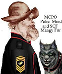
HB of CJ (old coot) Lt.Cm.

Sorry for rant. Errors like this are easily correctable, but were not. Why?


 and, Mangy Fur the Smart Alick Spacecat.